
The iPhone Duo Is Here: How We’re Getting Apps Ready for the Foldable Era
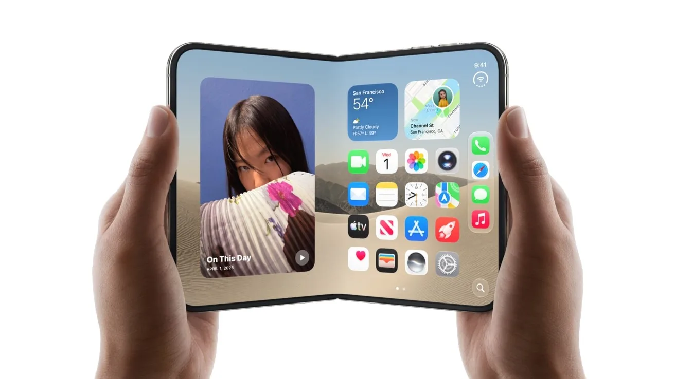
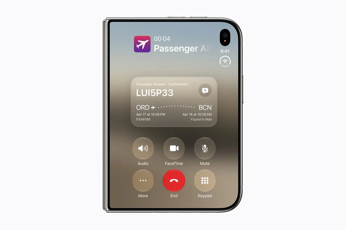
Yesterday, Apple did something it had resisted for years. At its “Surprise and Shine” event on September 9 — the first keynote under new CEO John Ternus — the company unveiled the iPhone Duo, its first foldable iPhone. A 5.4-inch outer display for one-handed use, a 7.6-inch inner display when opened, an under-display selfie camera with no visible cutout, and a starting price of $1,999. It ships October 23 on iOS 27.1.
For most people, this is exciting hardware news. For those of us who design and build apps for a living, it’s something bigger: the moment the “foldable question” stopped being optional. Samsung’s Galaxy Z Fold line has been around for years, but many teams treated it as a niche. With Apple in the game, foldables just became a mainstream target — and users on both platforms will expect apps to feel at home on them.
Here’s how our UI/UX engineers and iOS developers at Alpas are preparing to ship apps that work beautifully on the iPhone Duo and Samsung’s Fold devices — the challenges we expect, and how we’re solving them.
The Core Shift: One App, Many Shapes
For fifteen years, an iPhone screen had exactly one shape at a time. A huge amount of iOS code quietly assumes that. The iPhone Duo breaks the assumption three ways at once: there are now two displays, the screen can change shape while your app is running, and the safe areas are no longer symmetric.
Apple’s guidance, released the same day as the keynote, is clear: don’t build separate interfaces for each configuration. Build one adaptive layout that responds as the device opens, closes, and rotates. That philosophy — design for a continuum of sizes, not a list of devices — is exactly how good Android developers have handled Samsung’s foldables for years. The two platforms have finally converged on the same principle, which is great news for teams like ours that ship on both.
Challenge 1: Legacy Layout Code That Assumes a Single Screen
The problem
Common iOS patterns break on a two-display device. UIScreen.main becomes ambiguous when there’s no single “main” screen — Apple has flagged it for deprecation. Orientation checks used as a proxy for layout (“if landscape, do X”) produce wrong results when a wide inner display opens in what the system considers portrait. Hard-coded frame math falls apart when the canvas resizes mid-session.
How we solve it
We audit codebases for these patterns and replace them with the modern equivalents: accessing the screen through the window scene rather than a global, and driving layout from size classes (horizontalSizeClass / verticalSizeClass) instead of orientation or device model. Interestingly, the Duo’s inner screen reports regular size classes like an iPad — so any app we’ve already adapted properly for iPad is most of the way there. On Android, the mirror-image fix is Jetpack WindowManager’s window size classes instead of Display metrics, which handle the Z Fold’s inner and cover screens the same way.
Challenge 2: Designing for the Fold Itself
The problem
A foldable isn’t just a bigger screen — it has a hinge. Content that sits on the crease is hard to read. When the device is held half-open like a book, the usable area changes shape. And an app that simply stretches its phone UI across 7.6 inches looks lazy: giant buttons, endless line lengths, wasted space.
How we solve it
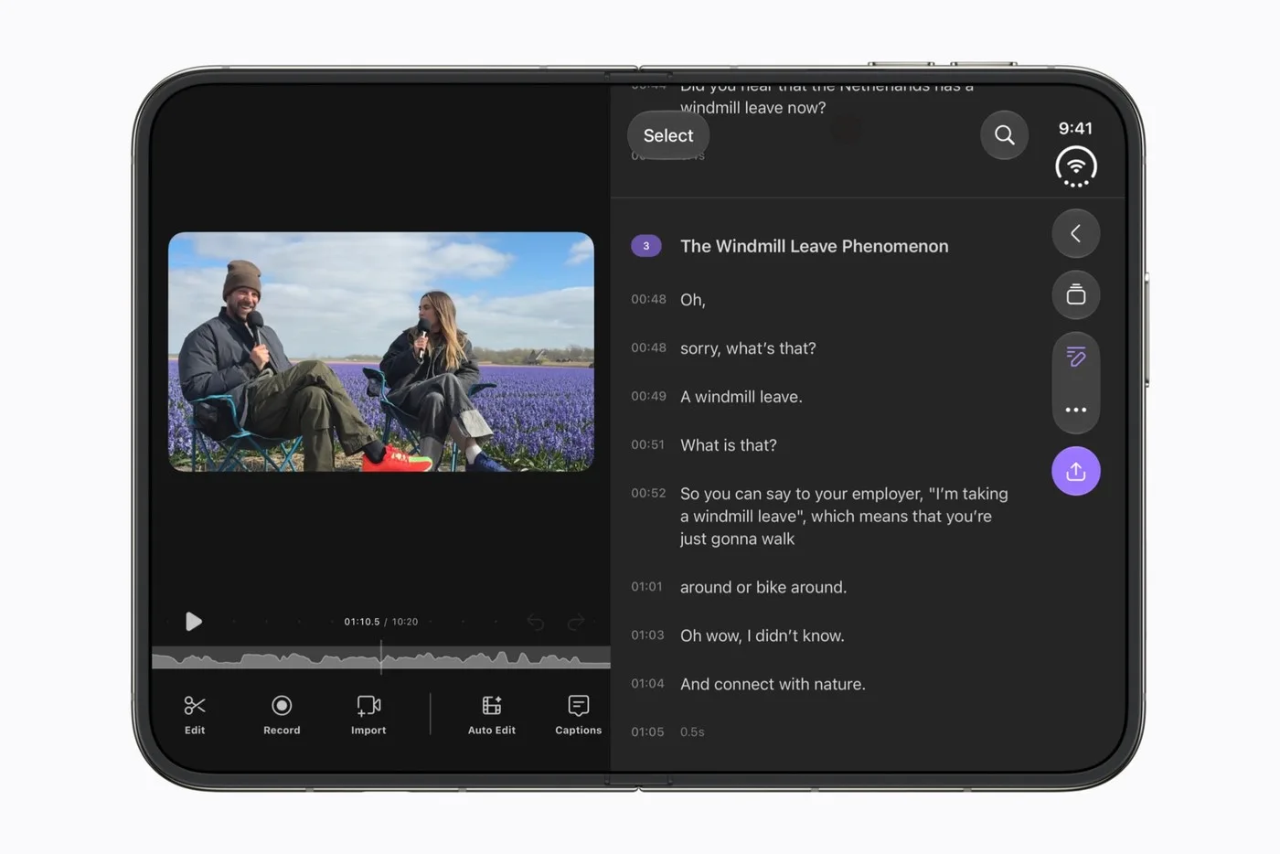
Our UI/UX team treats the unfolded state as a different workspace, not a bigger phone. That means designing two-pane layouts — list on one side, detail on the other — using components that adapt for free: on iOS, standard containers like NavigationSplitView, TabView and List already reposition themselves around the fold, and Apple’s new arrangement view organizes primary and secondary content dynamically. On Android, SlidingPaneLayout and Jetpack Compose’s adaptive layouts do the same, with the Jetpack FoldingFeature API telling us exactly where the hinge is so we can keep content off it. We also cap line lengths and use breakpoints, the same discipline responsive web design taught us a decade ago.
Challenge 3: Continuity — Don’t Lose the User Mid-Fold
The problem
The killer interaction on a foldable is starting something on the cover screen and opening the device to continue on the big display. If your app restarts, loses scroll position, or drops a half-filled form during that transition, users notice immediately — and it feels broken.
How we solve it
We treat the fold/unfold transition as a first-class event. On iOS, that means responding cleanly to scene size changes without tearing down state. On Android, it means rigorous handling of configuration changes — saved state, ViewModels that survive the transition, and testing the dreaded activity recreation path that many apps quietly fail. Our QA checklist now includes “fold mid-task” for every critical user flow: mid-checkout, mid-video, mid-form.
Challenge 4: Testing Hardware We Don’t Have Yet
The problem
The iPhone Duo doesn’t reach customers until October 23, and physical Samsung Fold units are expensive to stock for every configuration. How do you ship with confidence?
How we solve it
Simulators and emulators carry most of the load. Apple’s Xcode 27.1 beta includes an iPhone Duo simulator in Device Hub with on-screen controls to open, close, rotate and fold the virtual device through every pose. Android Studio has offered resizable and foldable emulators for years, covering the Z Fold’s postures including half-open “flex mode.” We run our full layout test pass in these tools first, then verify on physical hardware for the final release candidate.
One more practical note for iOS teams: apps compiled against older SDKs still run on the Duo, but they’re letterboxed inside a phone-shaped canvas. Rebuilding against the iOS 27.1 SDK is what unlocks true edge-to-edge use of both displays — so recompiling and re-testing isn’t optional if you want your app to look native there.
Shipping It: Our Rollout Playbook
Putting it together, here’s the path we follow to get a foldable-ready app into users’ hands:
- Audit the codebase for single-screen assumptions and fixed-size layouts.
- Refactor to size classes, window metrics and adaptive containers on both platforms.
- Redesign key screens for the unfolded canvas — two panes, better density, content clear of the hinge.
- Harden continuity so fold transitions never lose user state.
- Test every posture in simulator and emulator, then on physical devices.
- Rebuild against the latest SDKs and ship ahead of the October 23 launch window, so users unbox their new device and find your app already at home on it.
The teams that treated adaptive layout as a habit rather than a chore are being rewarded this week — for them, foldable support is an afternoon, not a rewrite. That’s the standard we hold our work to at Alpas Technology.
Building an App That Needs to Be Ready?
If your product needs to look great on everything from a budget Android phone to a $1,999 folding iPhone, that’s exactly the kind of challenge we enjoy. Talk to the Alpas Technology team about making your app ready for the foldable era.
Product images: Apple Newsroom.
Alpas Technology writes about building software — product practice, the tools we use, and the civic work in between. Get in touch to talk about your project.